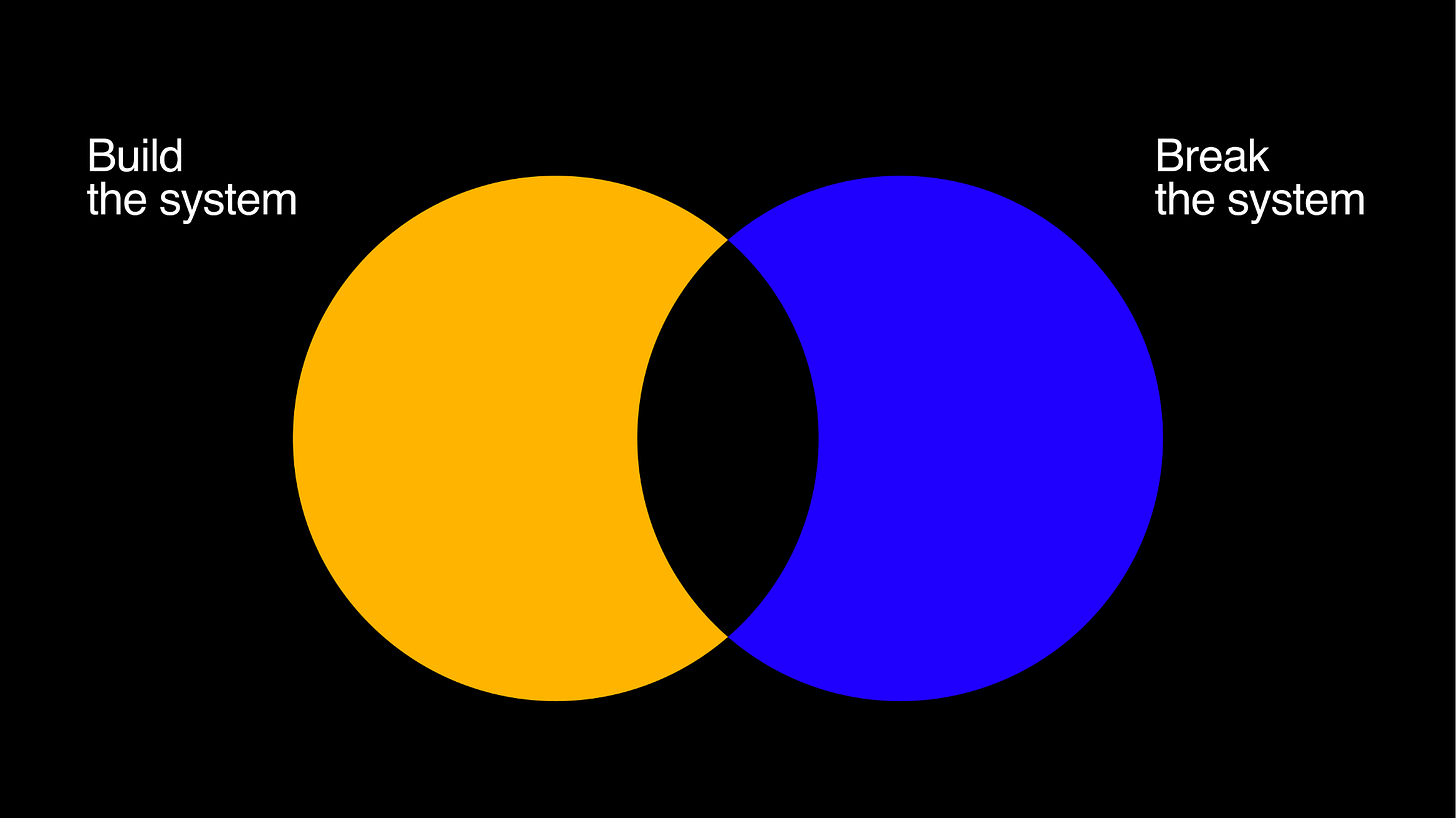
How to (properly) break your design system
Weekly curated resources for designers — thinkers and makers.
“In the early days of my career in digital product design, I saw a lot of designers around me getting frustrated. They saw themselves as artists, as creators. As if design was about channeling a higher force to generate ideas — that may or may not see the light of day. But what the work was asking them to do was quite different. Ninety percent of the job of a digital product designer is to think systematically about how a product will work: the rules, the requirements, the edge cases, the annotations, the hard work.”
How to (properly) break your design system →
Talk by Fabricio Teixeira for Adobe Max. The video player has a closed-caption (cc) option, but you can also check the visual transcript if you prefer.
The UX Collective is an independent ad-free design publication that elevates unheard design voices, reaching over 400k+ designers every week. Curated by Fabricio Teixeira and Caio Braga.
Editors’ picks
UX design isn’t killing creativity, money is →
How a limited view of UX research can be detrimental to design teams.The problem with “click here” and “learn more” links →
3 great ways to write helpful hyperlink text.Design edge cases and where to find them →
Why designing against edge cases is everyone’s job.
Accessibility Maze: a game to open your mind about other ways of browsing the web.
Make me think
Some thoughts on interfaces →
“One of the great myths of interface design is that all interfaces must be simple, and that everything should be immediately intuitive. But these aims are often contradictory - just because something is simple in its visual layout does not mean it will be intuitive.”Photoshop's journey to the web →
“The idea of running software as complex as Photoshop directly in the browser would have been hard to imagine just a few years ago. However, by using various new standardized web technologies, Adobe has now brought a public beta of Photoshop to the web.”Prioritize quantitative data with the Pareto Principle →
“Prioritize the 20% of your website or app responsible for 80% of a critical metric to generate substantial improvements for less effort.”
Little gems this week
Designing with ketchup: What tools do designers use? →
Diversity in design: Inclusion alone won’t fix a broken system →
The start of a new era for Responsive Web Design →
Tools and resources
UI & UX micro-tips →
The ninth volume of the series.Lottie for Adobe XD →
Bringing the magic of motion to Adobe XD.Disability checklist →
How to get your sh*t together as a designer.
Stolen stories: videos ripped from rich people’s Instagram that you can reuse to look fancy.


