I used to be in design, but now I’m product
Weekly curated resources for designers — thinkers and makers.
“The value of design is the value of creativity, of problem-solving through nimble thinking, and of outside perspective. If production is the ice, then design is the water — made of the same stuff, but inchoate, able to flow into hidden spaces. It is trust in a process that will allow you to go down dead-ends and come back up to find the proper solution three months from now.
If your role as an enterprise designer at a huge enterprise organization is to somehow get your hands around 10,000 slightly-off patterns, systemized templates start to seem awfully appealing. But is that…design? I’m not too sure.
I used to be in design, but now I’m product.”
Zeda.io is a complete product lifecycle management platform
[Sponsored] Zeda.io helps product teams with product discovery, strategy, building, and shipping in one centralized platform. Navigate through constant context switching, lack of visibility, tracking, and elongated feedback loops. Have real-time visibility on customer feedback, prioritize problems, nail product strategy, and keep all stakeholders in the loop at every step of the product-building journey. Zeda.io’s integrations with Intercom, Jira, Zendesk, Hubspot, etc., add a layer of automation on mundane tasks that intelligently improve outcomes.
Editor picks
Agile vs. UX →
Why the difference is not about quantity vs. quality.The price of privacy →
There is a lot we all don’t know.Eudaimonia and UX →
Reflections on inner capitalism.Persuasion vs. manipulation →
Who should take responsibility for evil UX?Good systems make good culture →
The balance between expert creators and iterative designers.
The UX Collective is an independent design publication that elevates unheard design voices and illuminates the path to design mastery and critical thinking. Here’s how we’re boosting stories through our partnership with Medium.
A project that documents street lettering and signage from India →
Make me think
Good conversations have lots of doorknobs →
“Physical affordances are things like stairs and handles and benches. Conversational affordances are things like digressions and confessions and bold claims that beg for a rejoinder. Talking to another person is like rock climbing, except you are my rock wall and I am yours.”The most important trend in video games didn’t happen overnight →
“Before the late 2010s, most games made little effort to accommodate players with motor, visual, or auditory disabilities. What appears to be a sudden change can be the result of a long process behind the scenes. The widespread shift we see today came about as a result of individuals working toward change for years.”Designing for (realistic) attention →
“Remember, 80% of your page’s visitors will not read it. Ever. 20% — at most — will. That doesn’t mean that 100% of your effort serves only 20% of your audience. It means that 80% of your audience can be considered active, while 20% of your audience should be considered ambiently aware. But 100% of your effort must go to serving 100% of your audience.”
Little gems this week
The image sorting experiment →
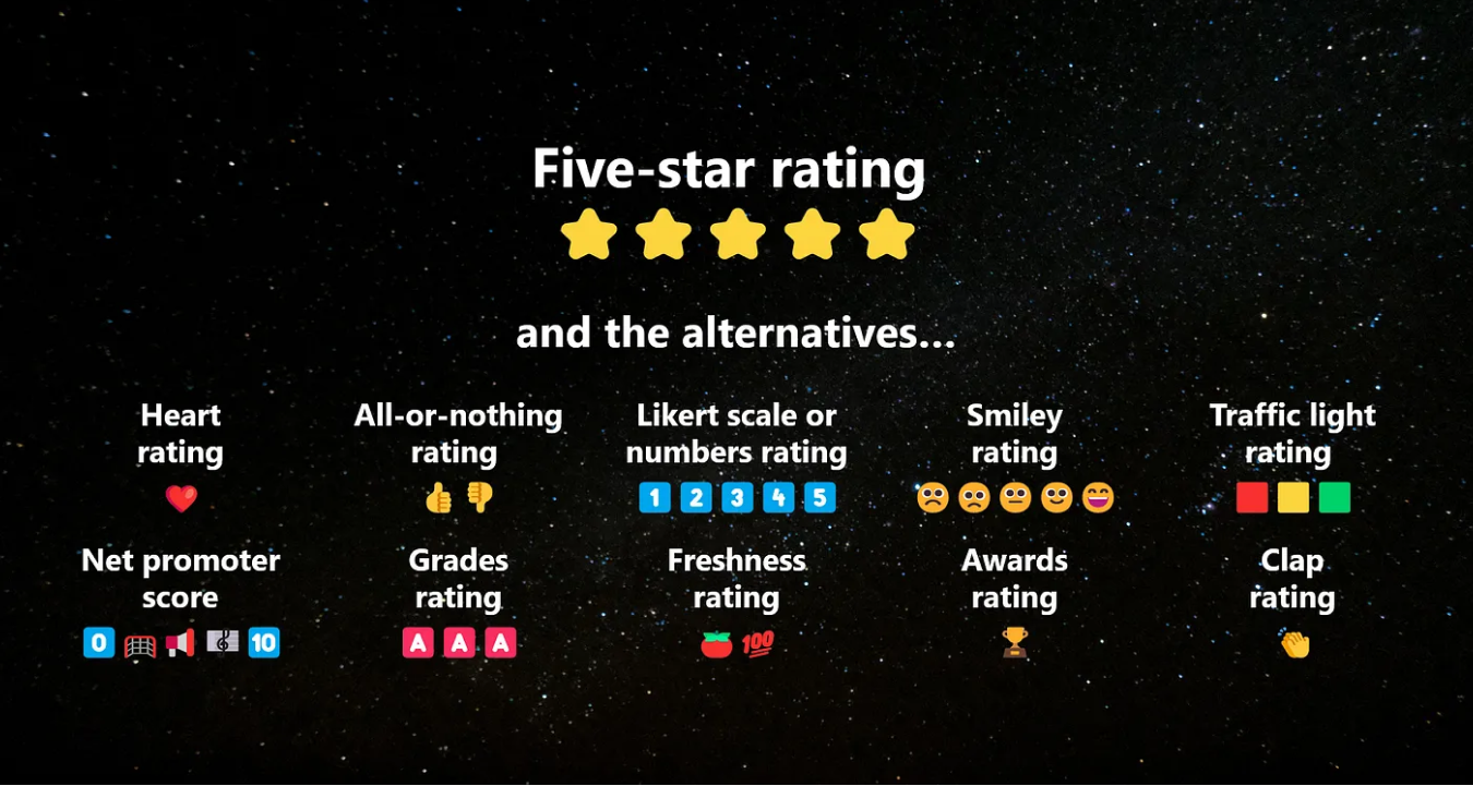
A war on stars: alternate rating systems besides 5 stars →
The waves of research practice →
Tools and resources
Scaling design systems in Figma →
How to avoid getting the red banner of death?What is ‘fake door’ testing in UX? →
Validating user demand and saving time.Cascading Figma components →
A different way to organize variants in your file.
Support the newsletter
If you find our content helpful, here’s how you can support it:
Forward it to a friend and recommend them to subscribe
Share open positions on our job board


