Lessons learned from a layoff
Weekly curated resources for designers — thinkers and makers.
“When the layoffs caught up with me, I was relieved. I had been secretly hoping I would be next because I felt stuck after having worked on the same products for 12 years (6 years on user documentation and another 6 years on UX writing). I had tried looking for other opportunities but just wasn’t very active because I still had a job. I thought this would be a good change.”
My first layoff was the best thing that happened to my career →
I'll bet that you didn't know Excel could do this...
[Sponsored] This free set of templates and tutorials summarizes a decade of experiments to make Excel look less like... Excel. It's all about using Excel's built-in design features to make boring spreadsheets stand out. You'll get a free Excel template to work with each week along with guidance and tutorials.
Editor picks
Adding motion to Atomic Design →
Defining the next decade of animation.What productivity tools miss about AI →
Incumbents often turn new technology into a feature.How can humans and AI work together? →
Towards a harmonious partnership.
The UX Collective is an independent design publication that elevates unheard design voices and illuminates the path to design mastery and critical thinking. Here’s how we’re boosting stories through our partnership with Medium.
Tiny illustrated sci-fi stories: a new micro-story every day →
Make me think
We use too many damn modals →
“Modals are the crutch of the inarticulate designer and developer. While there are genuine, good uses for them, many modals are disruptive, invasive, and confusing, used as an interaction junk drawer, hard to escape, poorly accessible, a frustrating user experience on small screens, and blocking the user's interaction with the parent window.”Perceptually uniform color models and their implications →
“Albert Munsell, an artist and professor of art at the Massachusetts Normal Art School wanted to create a rational way to describe color that would use decimal notation instead of color names which he could use to teach his students about color.”Consistent with what? →
“Consistency is a word you hear a lot in tech. Designers talk about it (do not play the “drink when you hear this word” game with this word at a design systems conference), developers talk about it, everyone! But when it comes to consistency, it’s important to recognize that consistency comes in different flavors.”
Little gems this week
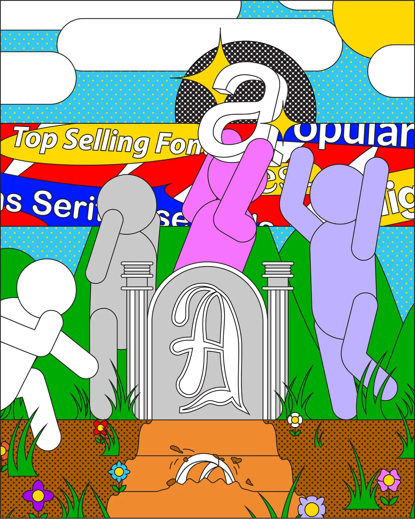
Fonts can die. Are we doing enough to save them? →
Resigns and gains, how the negotiation works in UX teams →
Figma, I love you but you’re bringing me down →
Tools and resources
Figma cheat sheet →
For developers using inspect mode.User journeys vs. user flows →
The differences in scope, purpose, and format.UX sheet: Preview and full display →
Making navigation easier for your users.
Support the newsletter
If you find our content helpful, here’s how you can support it:
Forward it to a friend and recommend them to subscribe
Share open positions on our job board


