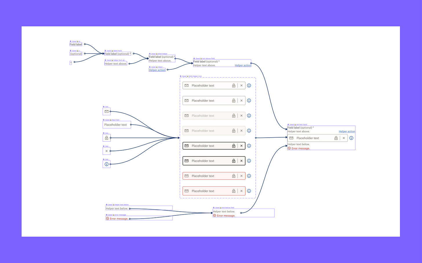
One Figma component — 3,360 variants
Weekly curated resources for designers who are thinkers as much as they're makers. Brought to you by your friends at the UX Collective.
Before the introduction of Variants, it was cumbersome to navigate a Figma asset library for components with multiple states or characteristics. More painful still was the challenge of creating naming conventions that were both concise and meaningful. The Variants feature eliminates this complexity entirely by allowing you to combine multiple components into one. You can also manage those states and characteristics by customizing “properties” and “values”. This makes it exponentially easier to use and maintain a given component.
One Figma component — 3,360 variants →
The UX Collective is an independent ad-free design publication that elevates unheard design voices, reaching over 410,800 designers every week. Curated by Fabricio Teixeira and Caio Braga.
Editors’ picks
Your most impressive work is missing →
Jared Spool shares what early-career folks should emphasize in their portfolio.Journalism says it’s a service, but it doesn’t think like one →
To survive, the industry must start delivering what its users need.Talking trash: A father’s primer on paternalism in design →
Real-world talk about the importance of a designer’s own awareness.
Is graphic design too trendy?
Food for thought
Medium workers union →
“Our strength as a company comes from a dedicated team of engineers, editors, reporters, data analysts, marketers, designers, curators, producers, partnership managers, and administrators — all who work tirelessly to help Medium be a force for good in the world. Our platform’s mission aligns with the greater purpose of social good, and we invest in mitigating harm in a landscape of tech and media that has historically deprioritized user safety and combating misinformation.”
The never-ending job of selling design systems →
“Here’s the cold, hard truth, friend: if you want to work on design systems, you don’t have a choice. Someone has to pay for your time, and that means someone has to sell what you do to an audience that speaks value in an entirely different language.”
Why does every advert look the same? Blame Corporate Memphis →
“The illustration style is flat, geometric, figurative, and usually made up of solid colors. The quirky, illustrative style favored by startups has caused controversy within the design community.”
The online pandemic graphics archive is an ongoing project and collation of COVID-19 signs.
Little gems this week
Framer is still alive and well… and it’s a game-changer
How to deal with designers in 10 easy steps
Interrelationships in design systems
Tools and resources
Same Energy →
A visual search engine with a rich visual understanding.Batch styler Figma plugin →
Change multiple text or color styles at once.FreezingCam →
Ever dreamed of freezing your webcam?


