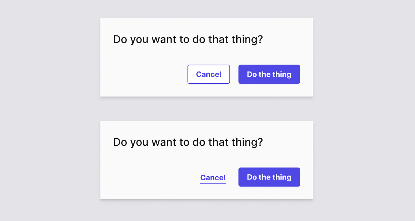
Should “cancel” be a button or a link?
Weekly curated resources for designers — thinkers and makers.
“A common type of dialogue that is often presented when interacting with a web app, is the “cancel” option — usually when the user is filling out a form, or manipulating data. One would typically see it next to a primary action, presented as a link. More and more however, this cancel option is presented as a button. Is this good or bad practice, and why?”
Should “cancel” be a button or a link? →
The UX Collective is an independent ad-free design publication that elevates unheard design voices, reaching over 500k+ designers every week. Follow us on Linkedin.
Editors’ picks
Data-driven branding →
Picking a good brand name with help of science.Sketching-first UX →
What if you started your process away from a computer?Blooming bar charts →
The growth of the data visualization industry.Simple product strategy →
How about we make Product Strategy simple?4 Xs that aren’t UX →
And why the original is still the best.
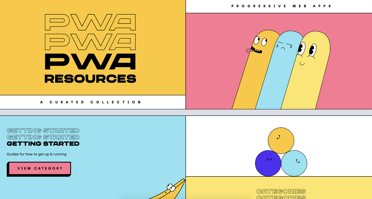
A curated collection of resources on Progressive Web Apps (PWA).
Make me think
The time trap of productivity →
“Simply put, productivity is a set of systems or rituals that protect us from future regret. Whenever we use Pomodoro techniques or time blocking methods, we understand the truth of our distracted minds and introduce friction to combat the entropy of attention. And for the most part, it helps. We get a lot more done and feel better about ourselves for doing it.”A grand unified theory of buying stuff →
“The problem is that certain kinds of stuff simply attract more stuff. The home is an obvious one: It craves sofas, sweaters, buffet cabinets, chandeliers. Computers are another; they grow USB tendrils. Smartphones beget earbuds, cloud backups, and music service subscriptions.”Building like it's 1984: scrollbars in web applications →
“All things considered, building custom scrollbars is an investment. If done poorly, unintuitive or unperformant scrollbars can wreak havoc on the user experience. But if done right, they can drastically improve your app, while still feeling invisible to the end user.”
Little gems this week
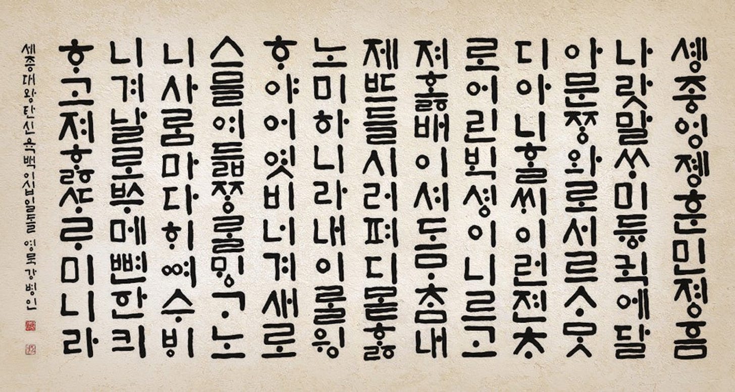
15th century UX & the Korean alphabet →
Why is dark mode so captivating? →
How should you name your colors in a Design System? →
Tools and resources
Foundations of Humane Technology →
An online course for professionals shaping tomorrow’s tech.Designing “above the fold”? →
Try the reciprocity principle.Overcoming imposter syndrome →
How to boost self-perception through communication, writing, and kinship.


