The aura of care in UX
Weekly curated resources for designers — thinkers and makers.
“In November 2022, Brian Chesky, CEO of Airbnb, began a tweet thread with “I’ve heard you loud and clear” in response to a customer backlash over the way they hid additional costs till the checkout page. “You feel like prices aren’t transparent…starting next month, you’ll be able to see the total price you’re paying upfront” he said about a change that could be made urgently in a day or carefully over a few.
The deceptive pattern was no mistake. That’s not empathy; at best, it’s apathy; at worst, it’s hate. The decision to fix it only came after the balance of business value and public relations started to tip the wrong way. Chesky presented himself as a model CEO doing right by his customers as if he wasn’t responsible for wronging them in the first place. People bought it, too. He demonstrated how bright a performative aura of care can shine to hide questions about the business activity or even questions about the business’s legitimacy to exist.”
Subscribe and you won’t hear from us again →
[Sponsored] Because who cares what we think? The Outlier newsletter is powered by community. From practitioners to industry leaders, every article, video, and event comes straight from the source’s mouth. But don’t take our word for it—subscribe and see what everyone else is saying.
Editor picks
UX from the 1970s Dutch masters →
Design philosophy inspired by Total Football.Move fast, break people? →
Welcome to the realm of organizational negative urgency.Today’s soul-crushing job market →
The shift from qualitative to quantitative hiring.
The UX Collective is an independent design publication that elevates unheard design voices and illuminates the path to design mastery and critical thinking. Here’s how we’re boosting stories through our partnership with Medium.
Time’s best inventions of 2023 →
Make me think
Until the right design emerges →
“Too often, the process of design is cut short. When faced with user needs or product requirements, many designers draft a mockup or wireframe informed by what they've seen or experienced before. But that's actually when the design process starts, not ends.”Test often to keep your designs simple →
“Rather than use the most complicated design first. The key is to try the simplest thing to build and get going. That way if you don’t need to build on more things, you don’t.”Design spacing tokens semantically →
“On the surface, selecting an amount of space seems to be a subjective determination. However, once we identify the why, we can encode the purpose into a systematic usage making the decision to choose one amount of space over another more clear and objective.”
Little gems this week
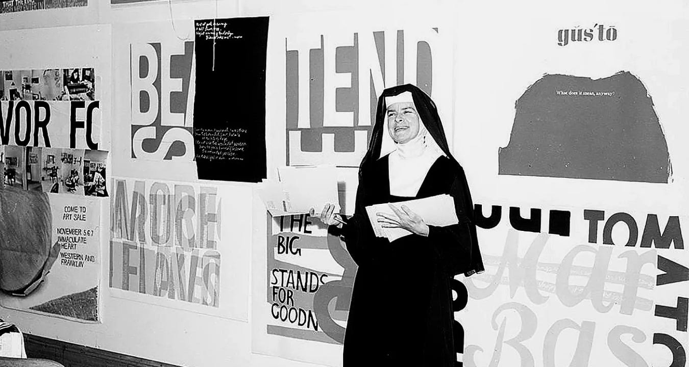
Corita Kent: teachings to free the creative spirit →
Level design breakdown: Shadow of the Tomb Raider →
Why the world is not designed for left-handed people →
Tools and resources
How to pitch user research →
Getting buy-in when budgets are tight.The journey, the experience and the system →
We need to shape the tools before they shape us.What we can learn from Plato about inclusive UX →
Usability from 2400 years ago.
Support the newsletter
If you find our content helpful, here’s how you can support it:
Forward it to a friend and invite them to subscribe
Share open positions on our job board


