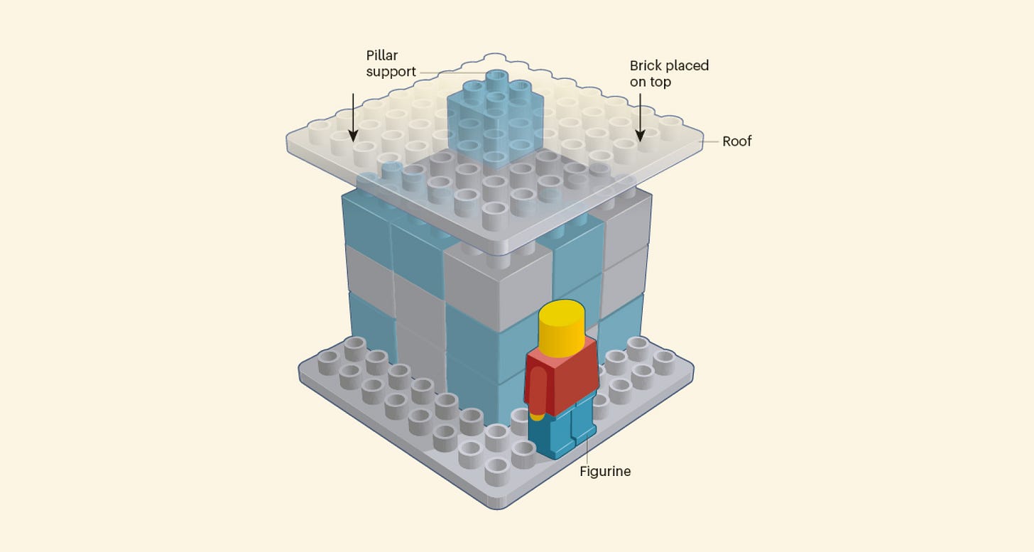
To add is expected, to subtract is design
Weekly curated resources for designers — thinkers and makers.
Generally speaking, people don’t get paid for removing features. They don’t get applause for eliminating jobs. And they rarely get promoted for telling their bosses they’ve been wasting their money. Much safer to propose something new, which is almost always additive.
If less is more, where are the incentives for people to develop subtractive solutions?
To add is expected, to subtract is design →
The UX Collective is an independent ad-free design publication that elevates unheard design voices, reaching over 420,600 designers every week. Here are our editorial plans for 2021.
Editors’ picks
Matt Gaetz and UX →
The dark pattern that may bring down Matt Gaetz.NFT fanatics →
You bought a pixel for $1.4 million.Don’t neglect visual design →
A mistake, especially common among junior UX designers.
A case study about title treatment concepts for Disney and Pixar’s new film Luca.
Food for thought
Don't let your design system seem complete →
“The more professional and finished something is, the less likely people are to add to it. Maybe a typo here and there. This happens with prototypes all the time. The more polished something is, you reduce the type of feedback you get.”
The healing power of JavaScript →
“The point being that a habit of reaching for code is not only healing for the self, but a trick to transmute a sense of dread into something: A function that seems to add, however trivially, a small bit of value to the greater whole in a troubling moment.”
Against loving your job →
“The “labor-of-love myth” — the idea that certain work is not really “work” and therefore should be done out of passion instead of pay — is cracking.”
When capitalism gives you blisters: a brief tale of the education of a corporate designer.
Little gems this week
How Netflix’s binary rating system is hurting our documentaries →
Monsieur Bézier and his elegant curves →
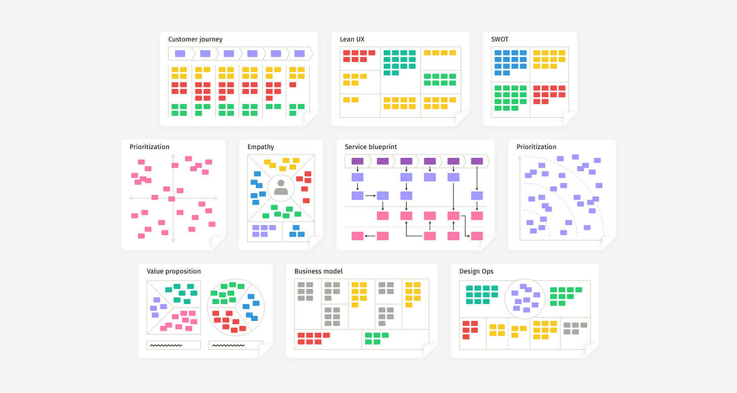
Comprehensive anatomy of all ‘Design Thinking’ workshops →
Tools and resources
Figma auto-layout →
A guide so you can finally understand how Auto Layout works.Headless UI →
Unstyled, fully accessible UI components, integrated with Tailwind CSS.Inclusive UX research →
What does it mean to be inclusive in UX Research?


