Why do we round corners?
Weekly curated resources for designers — thinkers and makers.
Rounded corners — they’re everywhere. From software user interfaces to hardware product design, there is something intrinsically satisfying about the look and feel of a rounded corner. In fact, designers have been using them so much that they became an industry standard rather than a design trend. But why are rounded corners so popular?
The UX Collective is an independent ad-free design publication that elevates unheard design voices, reaching over 500k+ designers every week. Curated by Fabricio Teixeira and Caio Braga.
Editors’ picks
Designing design skills →
How to design skill grids of your product design team.Assistive tech overview →
Accessible technology and the accessibility tree.Decentralized finance →
10 things I’ve learned designing DeFi.
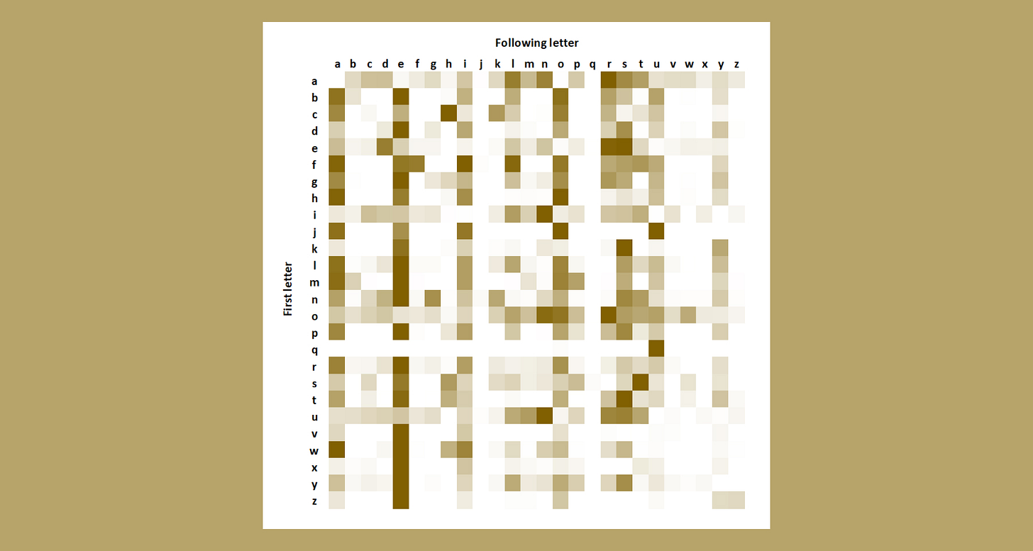
Mathematician and wordplay fan Ali Lloyd share his thoughts on hit internet word game Wordle.
Make me think
The difference between correct-ness and useful-ness in a design system →
“At some point it gets tricky to decide what should be in the Figma library vs. what should be in something that lives in Storybook. Do we put all our guides about how to use these components in Figma? Or what about the does and dont’s? What about props and component names—do we follow precisely what’s in Storybook even if it’s bad or something we’re embarrassed by?”When is the revolution in architecture coming? →
“Something is terribly wrong with architecture. Nearly everything being built is boring, joyless, and/or ugly, even though there is no reason it has to be. The architectural profession rewards work that is pretentious and bland. The cities we build are not wondrous.”
Little gems this week
3 historical instances in which dataviz saved humanity →
Content-first: thinking about hierarchical grids →
Making design systems flexible with design tokens →
Tools and resources
Icônes.js →
Icon Explorer with Instant searching.UX vision statement →
Creating vision statements to increase team alignment.Inclusion-first →
How to make your product accessible and inclusive.


